Branding | Packaging
Is your mouth watering? Well, it’s about to be, introducing the crispiest and freshest new fried chicken shop- Cluckin’ Good Chicken!
Cluckin’ Good Chicken does NOT mess around when it comes to a good crunch. The team over at CGC believe in one thing- chicken shoul be fried, juicy, crispy and shared! CGC is looking for a brand designer who can make magic. They want a brand identity that’s gonna stand out from the rest and blow people’s socks off.
Brief- @thegrowandglowclub


Brand Values

FRIENDLY
LOYAL
COMMUNITY
CGC is like that one friend who is happy to help us in any situation and comforts us.
While believing in brand-customer loyalty,
CGC aims to provide memorable experiences
to each customer.
CGC aims to bring people together and
believes chicken should be shared and enjoyed
together.


When the logo using negative space was created, there were many legibility issues with it. People couldn’t understand the brand name and read it wrong. The strokes in the letter ‘u’ looked too sharp compared to other alphabets in the typeface. It also didn’t stand out to most people as the leg piece was a very subtle element, which almost went unnoticed. Hence, the idea wasn’t pursued.

Combination mark
The combination logo features a cheerful chicken face seamlessly integrated within the letters 'O and O' of "Good," symbolizing that the brand is happy to serve its customers. To convey the essence of spice, which is a preferred taste palette in fried chicken, a minimalistic version of a chilli stem has been used in the letter ‘i’.
Instead of maintaing the typeface as it is, I decided to customize it a little. To make the brand more visually intriguing, the letters 'k' and 'd' and ‘n’ have been stylized. This unique touch adds to the brand's originality and overall appeal.

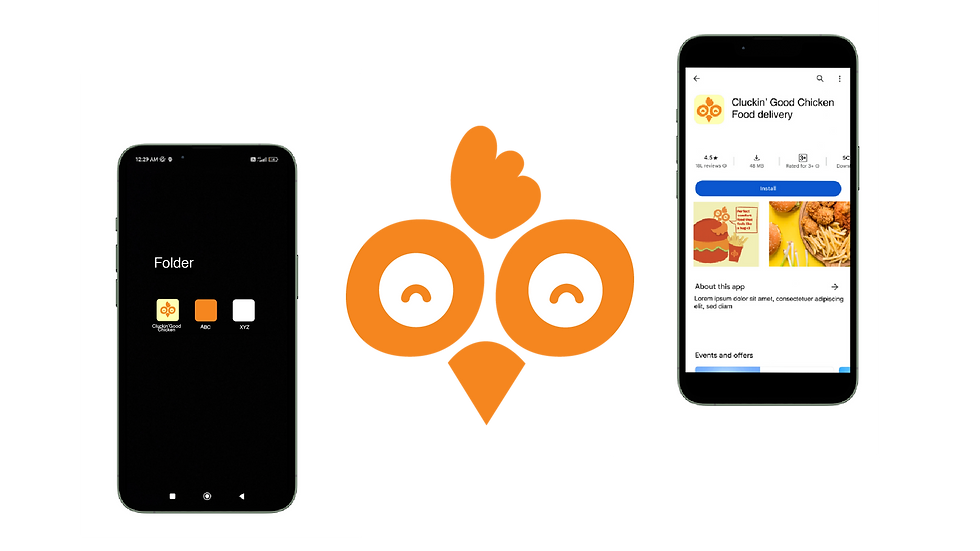
The identity mark has been picked from the combination logo.
I decided to keep the smiling chicken face because
being friendly is one of the core values of the brand.


DIJON YELLOW
#FEFFB4
BUFFALO ORANGE
#FF8700
CLUCKIN' RED
#D41D00

CLUCKIN' RED
BUFFALO ORANGE
DIJON YELLOW
Red stimulates hunger and increases energy. It evokes excitement and urgency which align with the fast-paced environment of fast food.
The color draws inspiration from the
widespread popularity of buffalo sauce, commonly paired with fried chicken. This hue mirrors the distinctive shade of buffalo sauce.
The brand is friendly and inviting. To
communicate this feeling a light yellow
has been used. It is also contrasting to the red. This hue also resembles the color of dijon mustard.

A sans serif font has been chosen for better legibility. Since the brand has a longer name, a serif font would’ve been difficult to read. It also conveys that the brand is friendly and approachable.


Image credits-
Wix
Freepik
Shutterstock
Mockup Credits- unblast.com
Software used


